Nap York Booking Platform
A modern hospitality platform revolutionizing urban rest with a seamless booking experience, interactive UI, and automated check-in system.

Project Overview
Develop an innovative booking platform for Nap York's unique hospitality service that offers urban rest pods across New York City, creating a 'third place' between work and home with the ease of booking an Uber.
Key Achievements
- Completely revamped the platform's user interface, increasing user engagement by 40%
- Built a streamlined self check-in process that reduced wait times by 70%
- Redesigned the email template system, reducing 10,000+ lines of code to just 90 lines per template
- Implemented a mobile-first design approach ensuring perfect responsiveness across all devices
My Role
As the lead frontend developer, I was responsible for designing and implementing the entire user interface for the platform. This included the booking system, self check-in application, and email templates.
Project Stats
Project Links
Visual Transformation
View the dramatic UI improvements made to the NapX platform. Drag the slider to compare before and after versions of key interfaces.
Move the slider to compare. Open either image for a closer look.
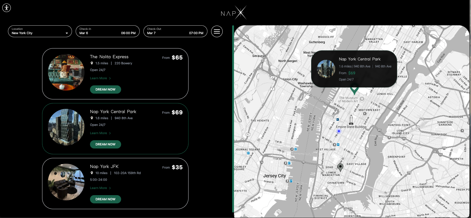
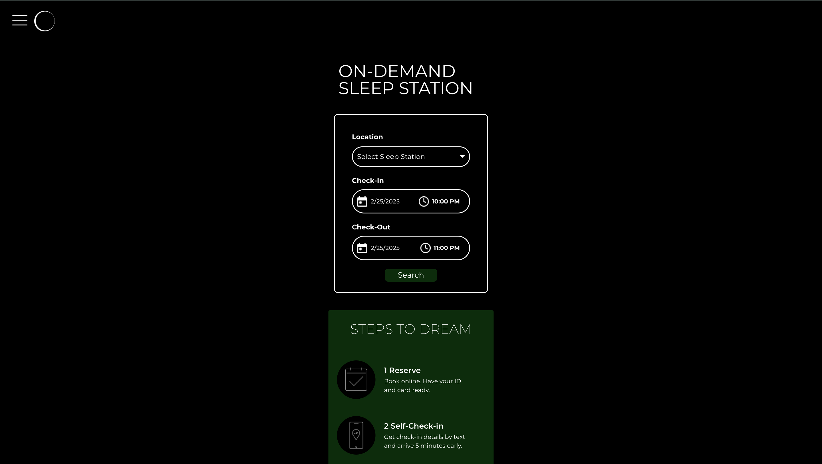
Main Home Page
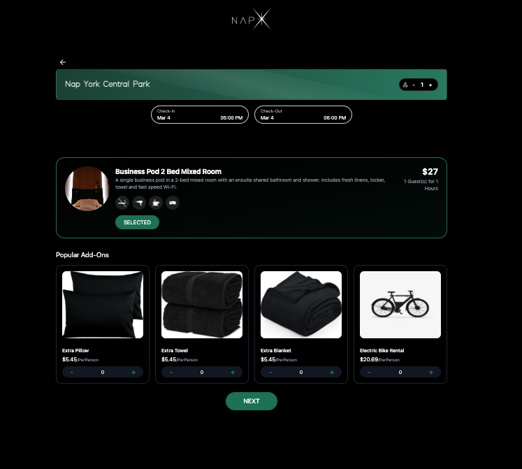
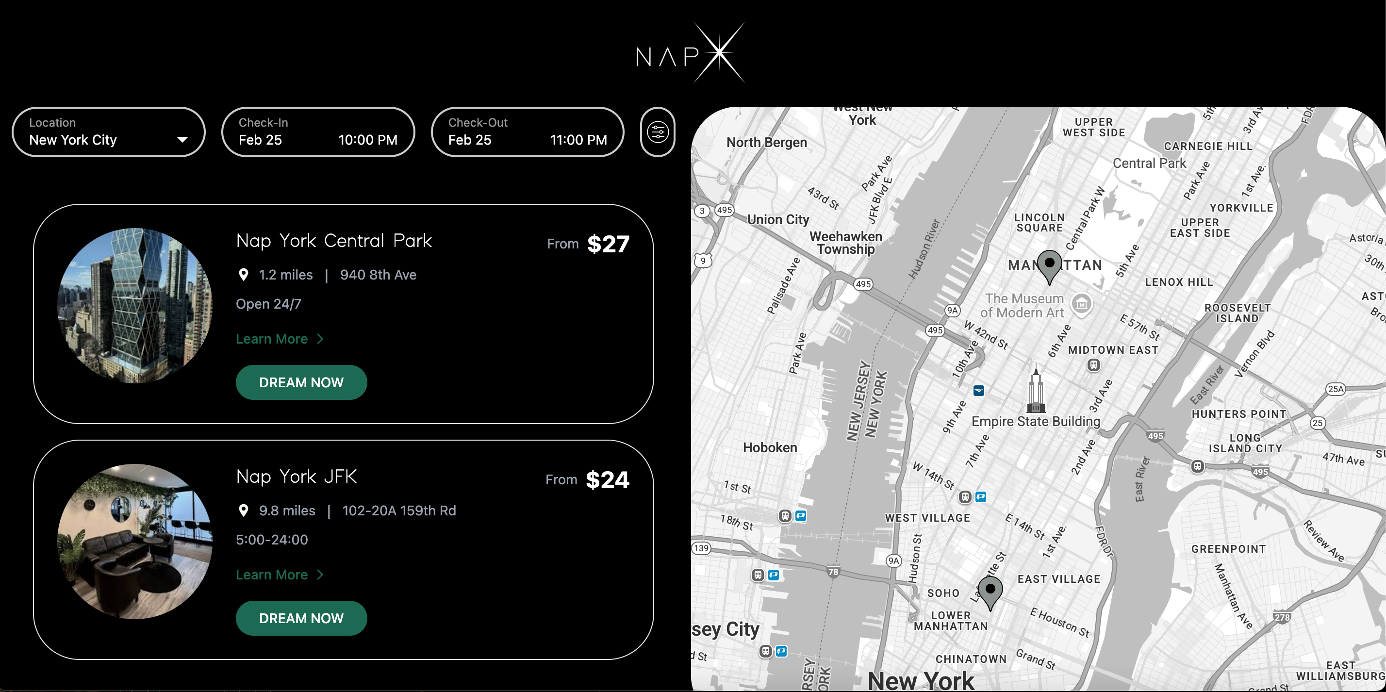
Redesigned the home page with a clean, modern interface featuring an interactive map and location cards.
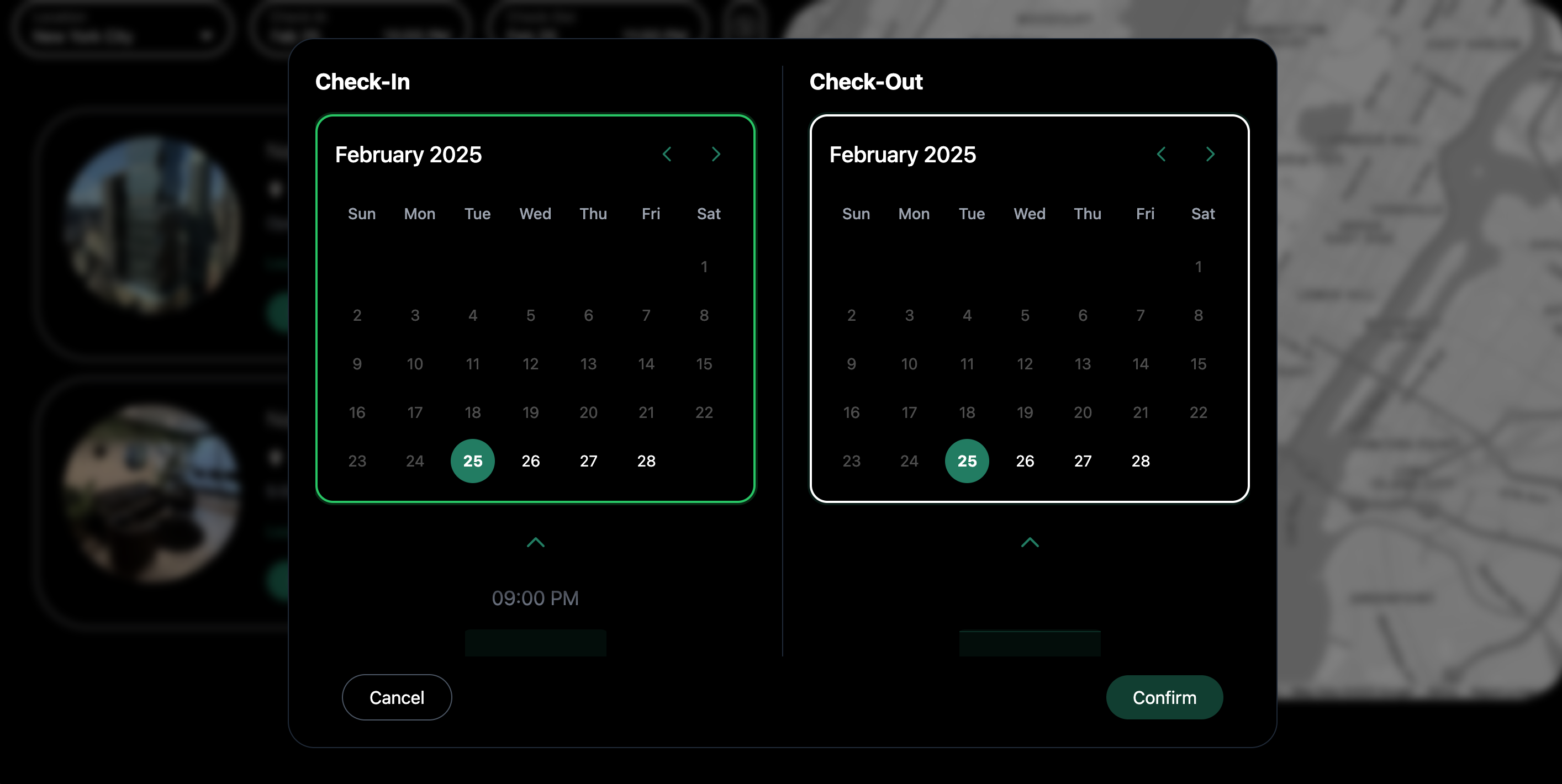
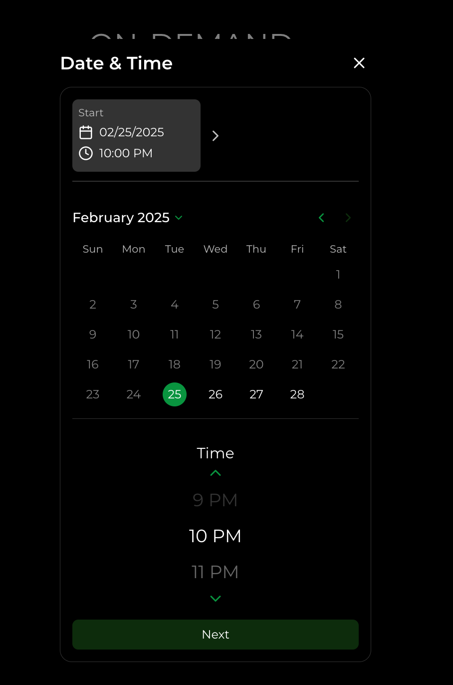
Calendar Interface
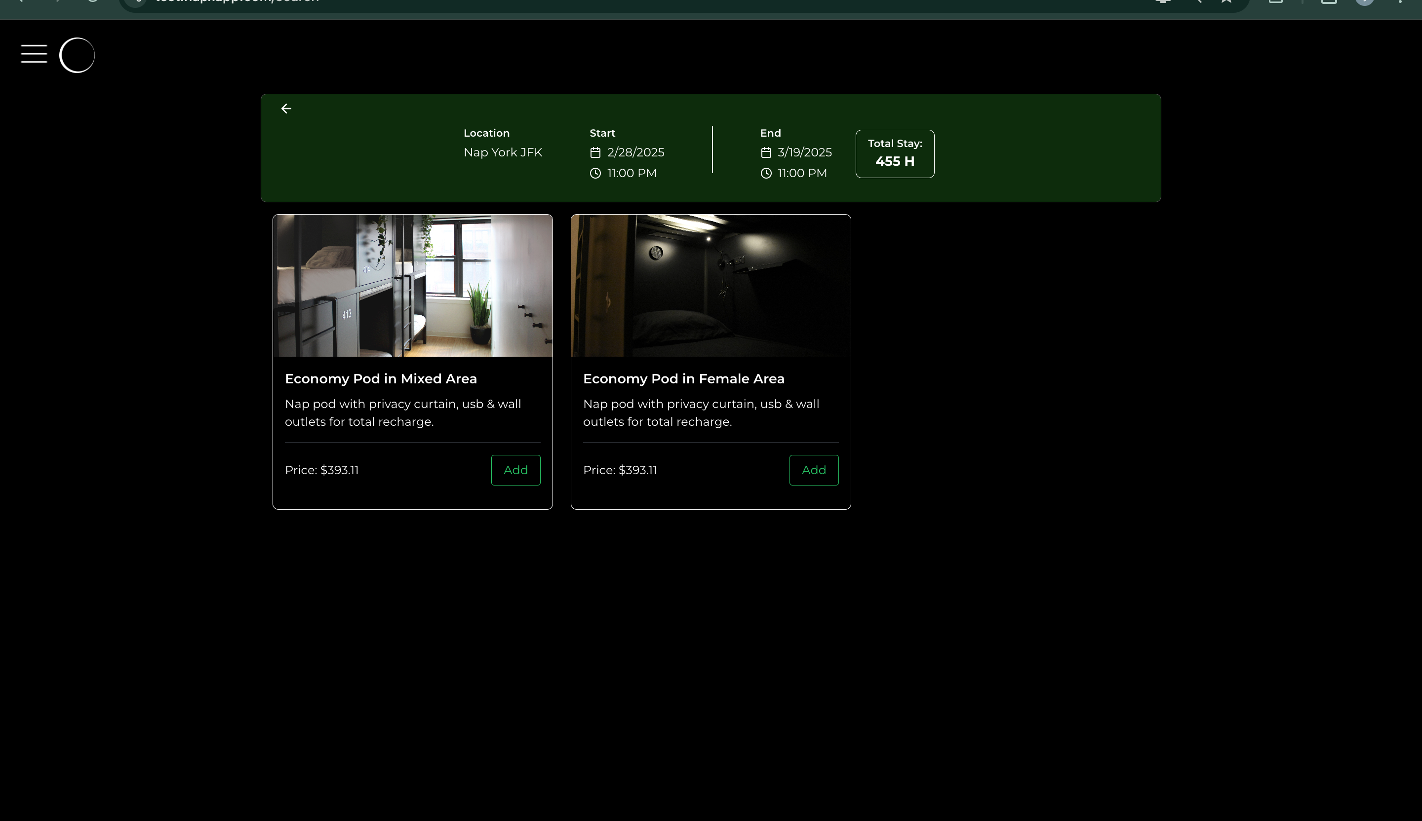
Transformed the cluttered calendar system into an intuitive dual-calendar layout with seamless date selection.
Location Selection
Reimagined the location selection process with visual cards and interactive map integration.
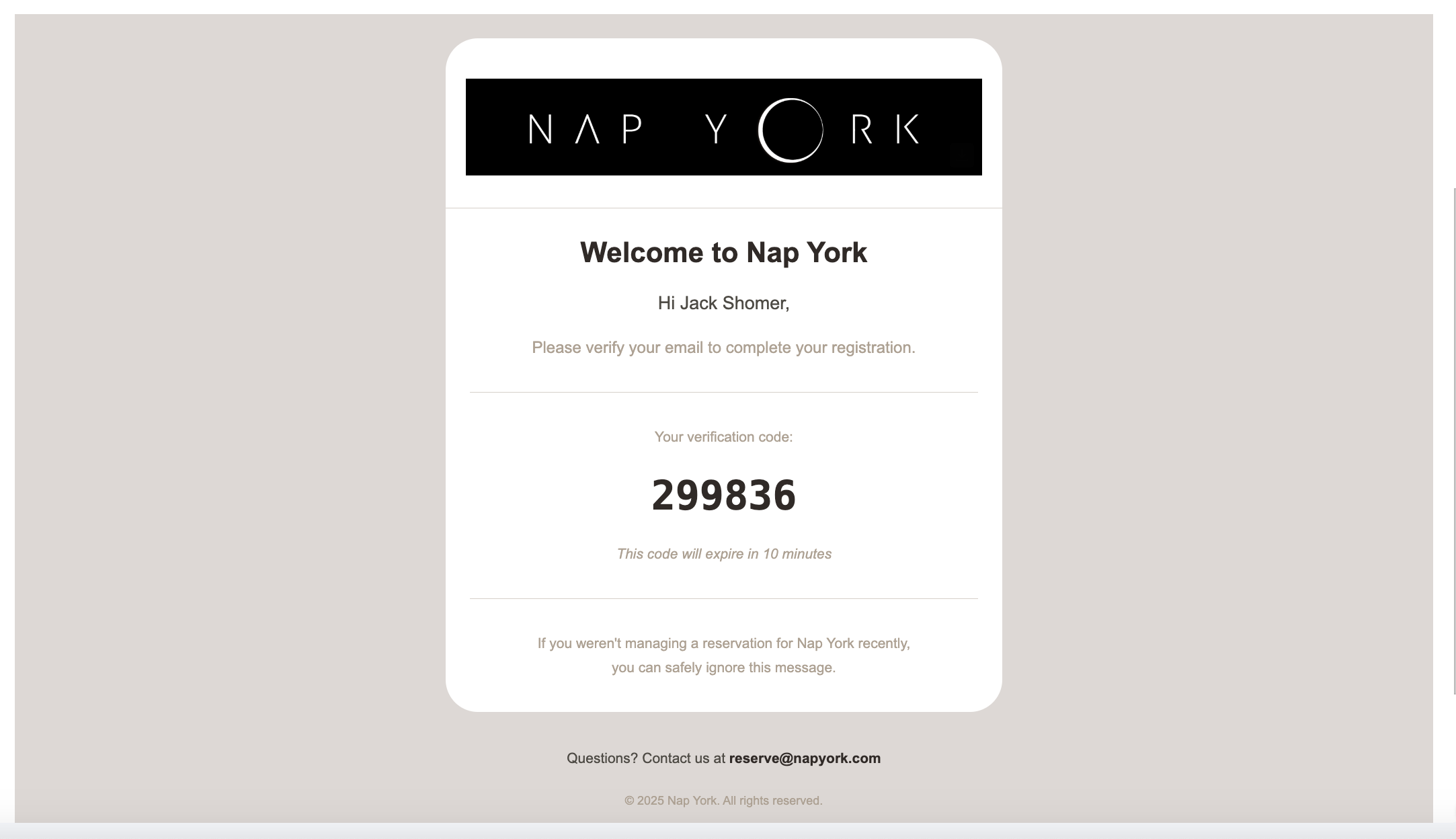
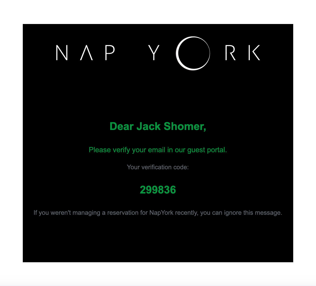
Email Verification
Completely transformed the email system, replacing inefficient HTML with a modular MJML design that reduced 10,000+ lines of code to just 90 lines while dramatically improving appearance.
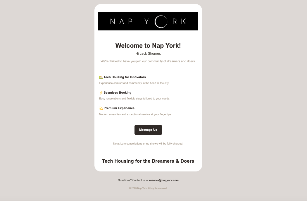
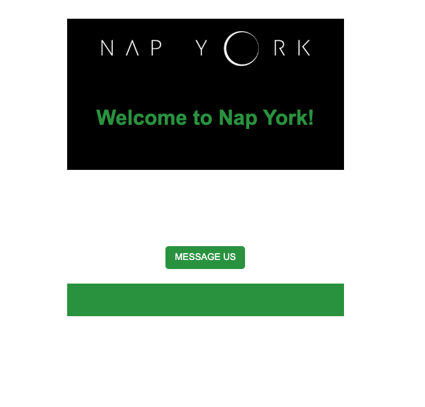
Welcome Email Template
Redesigned the welcome email with a warm, inviting layout that aligns with the brand's identity while ensuring perfect rendering across all email clients.
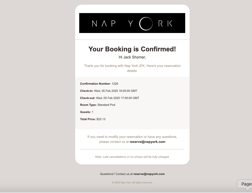
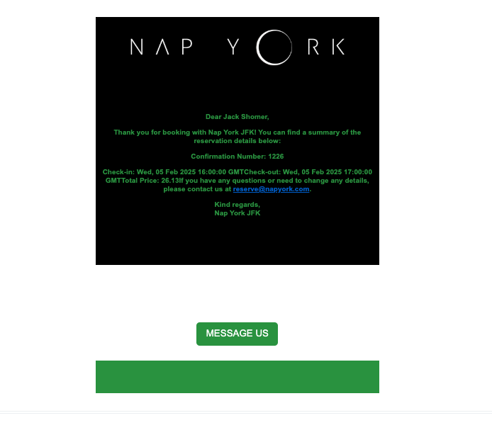
Booking Confirmation Email
Transformed the booking confirmation emails from plain text to a visually appealing format that clearly presents reservation details and enhances the customer experience.
Self Check-In Application
The Challenge
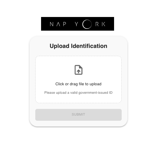
My journey at Nap York began with a challenging assignment that would define my role. Despite being contracted for just 12 hours a week, I committed myself fully to the project when tasked with reimagining the self check-in application from scratch. The existing frontend was poorly designed and needed a complete overhaul.
My Approach
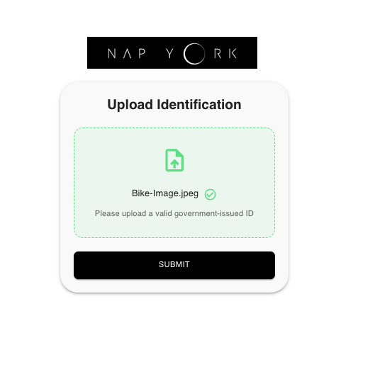
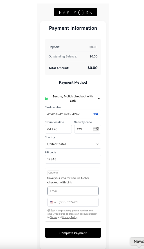
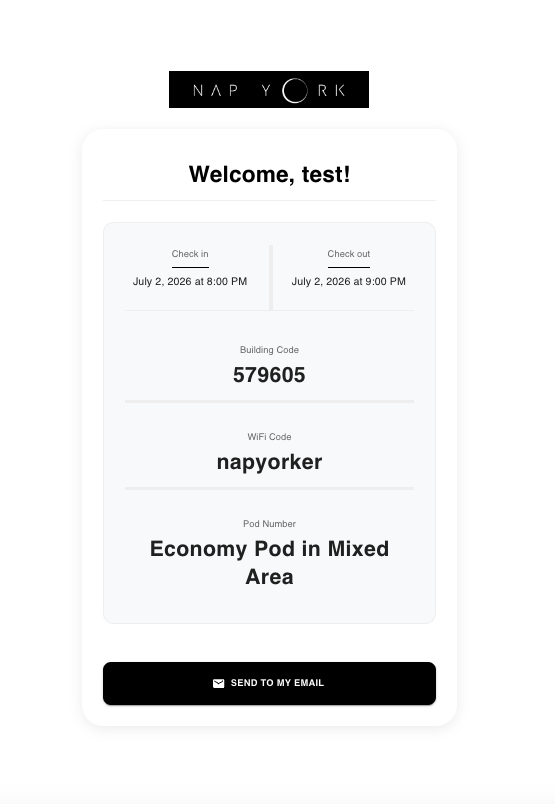
Within just one week, I delivered a completely rebuilt frontend using React (Vite/JSX) with an intuitive Material-UI design. The application featured a sophisticated identity verification system, digital signature capabilities, and seamless document storage through AWS S3 integration. The clean, modern interface earned immediate praise from management and set a new standard for the company's digital products.
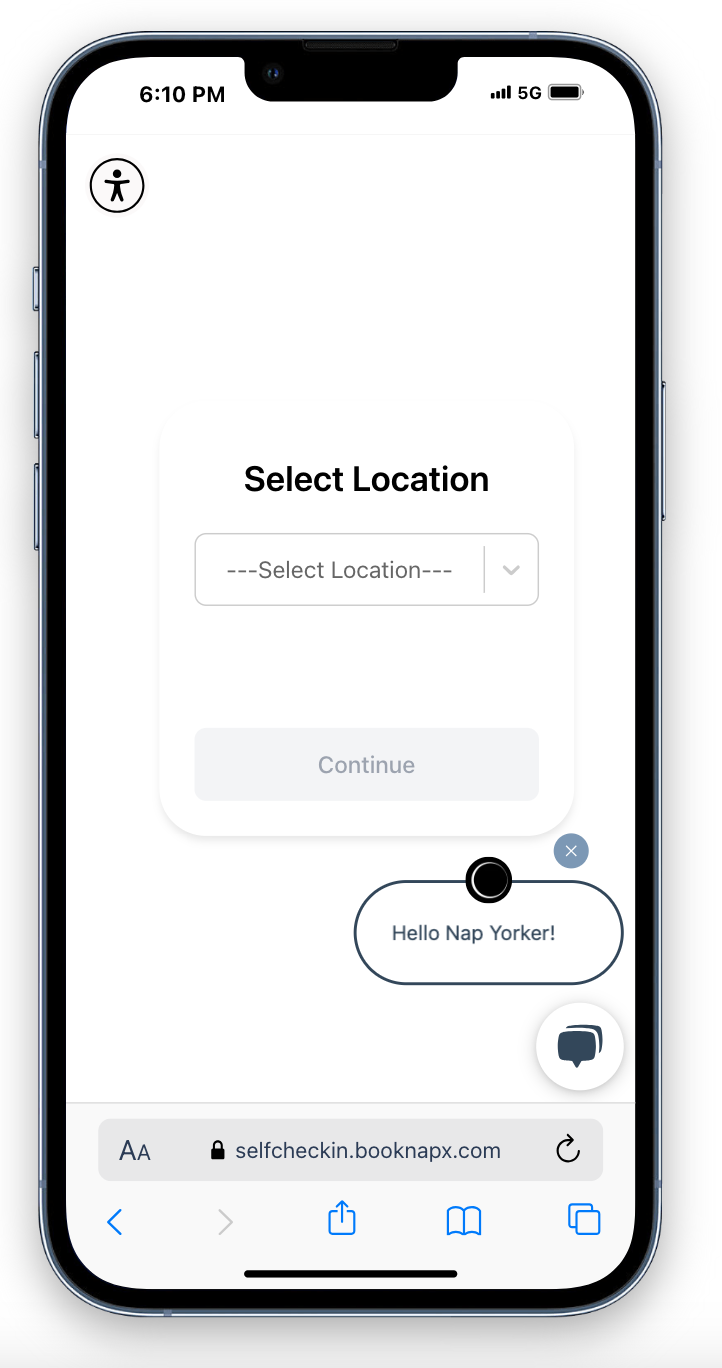
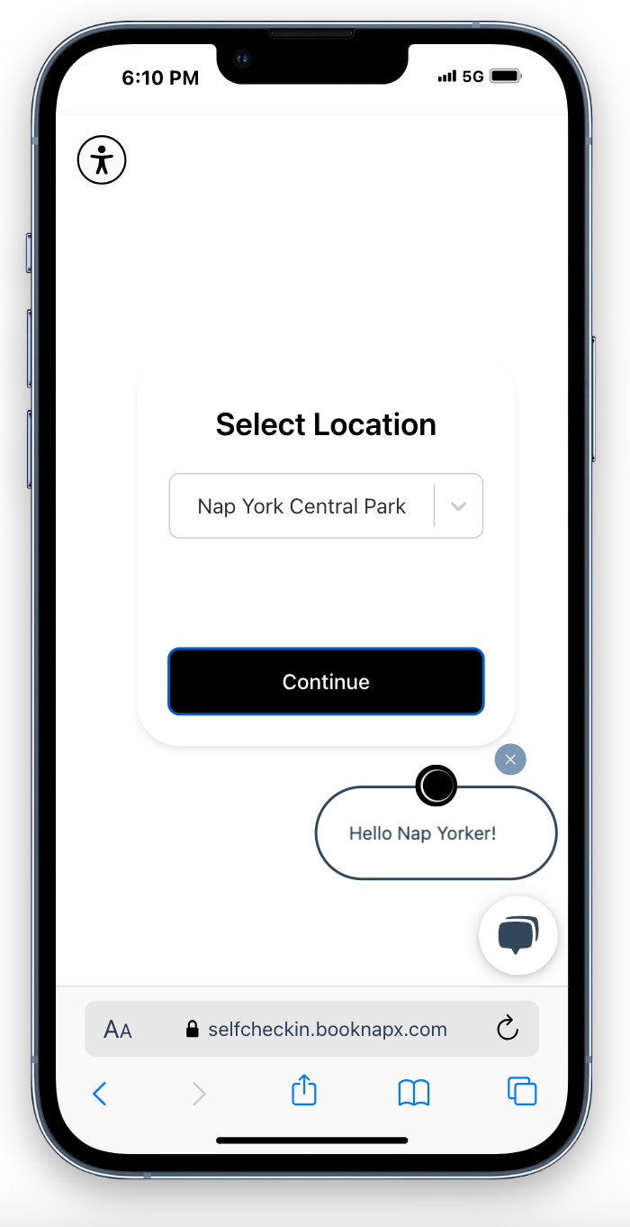
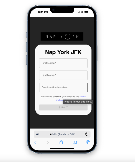
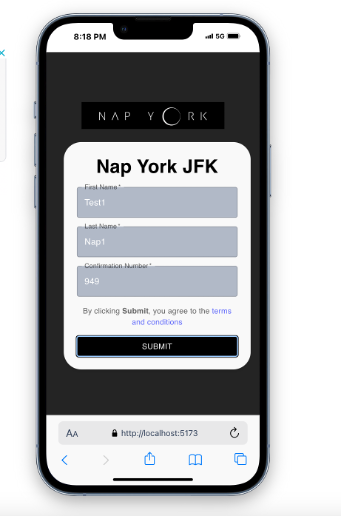
Self Check-In Application
8 imagesThe redesigned self check-in application with modern UI elements
Key Challenges
- Inherited a poorly structured codebase requiring complete reimagining
- Tight one-week deployment deadline despite the extensive work required
- Complex integration requirements with MEWS, AWS S3, and MongoDB
- Implementing secure identity verification while maintaining ease of use
- Creating a signature feature that worked across all devices
Results & Impact
- Delivered a completely reimagined frontend that improved UX by 10x
- Successfully deployed within the one-week deadline
- Created an intuitive verification and signature system that streamlined the check-in process
- Implemented a secure document storage solution with AWS S3
NapX Main Booking Platform
The Challenge
Following the success of the check-in app, I took ownership of the entire frontend for the main booking platform. The task was to create a modern, user-friendly interface that would make booking a rest pod as simple as calling an Uber.
My Approach
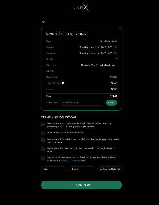
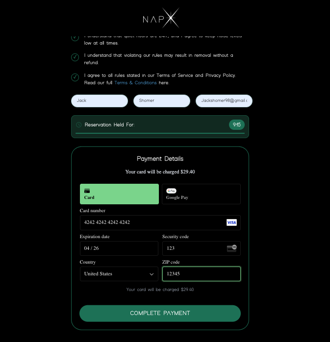
I implemented a mobile-first responsive design with a modern split-screen layout featuring an interactive map on one side and an elegant booking interface on the other. The platform includes location cards with smooth animations and hover effects, a beautiful calendar for check-in/out selection, interactive map features with pop-up location details, and an intuitive add-ons page. Every aspect was designed following Schneiderman's heuristics, ensuring consistency, clear user feedback, and intuitive navigation throughout.
Main Booking Platform
6 imagesThe redesigned booking platform with interactive map and intuitive reservation flow
Key Challenges
- Designing for a user base that is 70% mobile, requiring perfect responsive design
- Implementing real-time availability checking and complex booking logic
- Integrating interactive maps with location-specific data
- Creating a clean, intuitive interface for a multi-step booking process
- Balancing aesthetic design with performance requirements
Results & Impact
- Established a scalable architecture supporting multi-city expansion
- Created a responsive design that works flawlessly across all devices
- Implemented comprehensive Jest-based testing ensuring a bug-free experience
- Designed an interactive map interface enhancing location discovery
- Built a booking system that simplifies complex availability requirements
Email Template System
The Challenge
The existing email templates were inefficient and visually unappealing, with over 10,000 lines of complex HTML that was difficult to maintain and update. The company needed a cohesive, professional email template system that would make a strong first impression with new customers.
My Approach
I completely revamped the company's email system, replacing inefficient HTML email templates with a modular MJML system. This reduced the code to just 90 lines per template while dramatically improving visual appeal and maintainability. Beginning with extensive research on warm, pleasing color palettes, I created a visually cohesive email design that enhanced brand identity and user experience. I meticulously planned each color component - soft grey backgrounds, clean white cards, and carefully selected text colors - creating a comprehensive design system before writing any code. The templates feature consistent styling with subtle details like proper spacing, clean typography, and responsive layouts that render perfectly across all email clients.
Email Templates
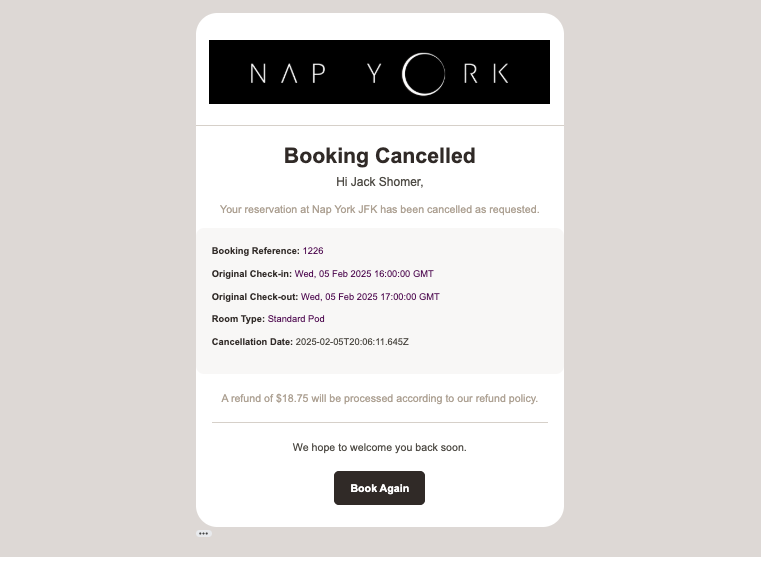
I designed a series of professional email templates that create a cohesive brand experience throughout the customer journey.
Email Template System
4 imagesRedesigned email templates with consistent branding and modern design
Key Results
- Reduced template code size by over 99% while improving maintainability
- Enhanced visual appeal with consistent branding and modern design
- Improved performance by optimizing template rendering
- Created a modular system allowing for easy template updates and additions
- Established a visual language for all company communications